|
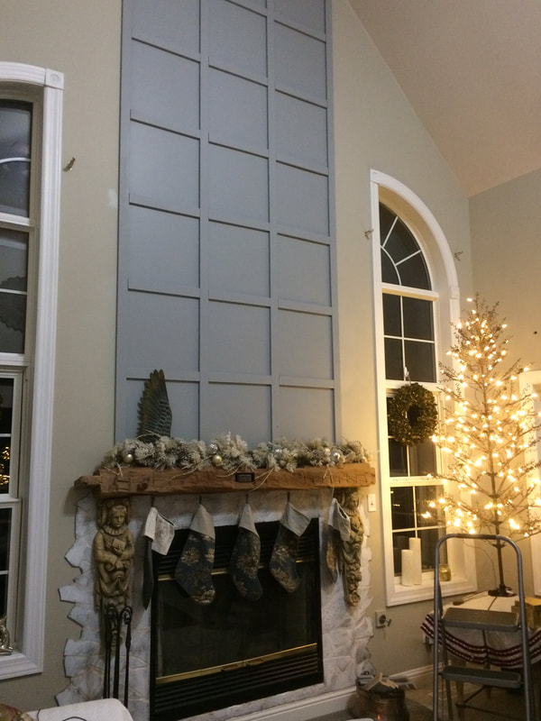
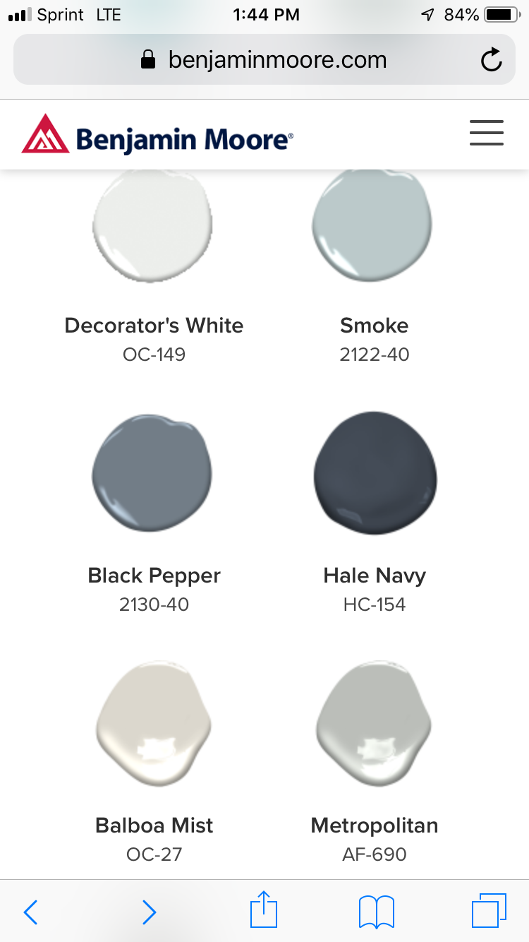
I'm going to post a few pictures of adding simple modern moldings to the faces of the walls leading to the sanctuary, maybe to the wall that flank the kitchen and lead toward the church offices. Also some color palette ideas.
I like the idea of getting some examples together of what we like, like Heidi referring to the interior at Ulta.
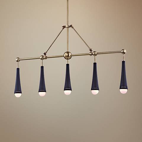
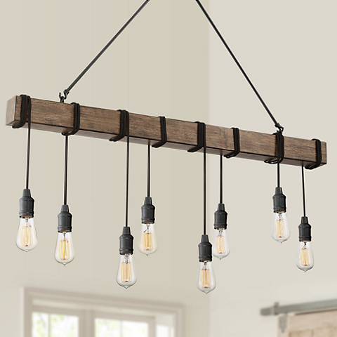
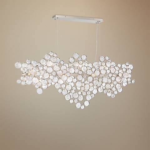
If Heidi could start doing some background research on types of commercial lighting warm v cool, fluorescent v LED, etc , ability to covert what's already there, we can consider what that does to wall color. Paula, could you start doing some shopping for stunning light fixtures, either pendants or kitchen island long pieces, etc that we could incorporate along the walls to the sanctuary, and inset in that niche area to the left of the clock? Where else could we put them? Ann, let's start thinking about what warm grays or creamy whites we could add to the walls to add interest but aren't going to turn into a sickly color under new lights. And obviously, everyone, chime in on any of it. First, I have the go ahead to start ordering new interior directional signs. The individual room signs will now be a decal on an acrylic 8.5x11" pocket, that will allow users to drop a sheet of paper in for special uses "2nd Grade Sunday School" or "Prayer Workshop & Basketry" etc.
(I'll try and get a pic here to show you for reference.) Obviously, I'd like to have the directional signs compliment these-- however I thought this might be a chance to have a wooden plank background to the aluminum sign, that could tie in with other parts of the building, if repeated. If you're okay with that, maybe you can chime in on the kind of wood tone/stain that wood warm it up without looking like honey oak from the 80s or shiplap farmhouse. I'll try and put a couple of samples here, soon. As we mentioned before, we'll focus on what we need to do, what we can do now, and what we may be able to do (later, after some money is raised.) We have the authority to go ahead and make changes , primarily to the Fellowship areas, the signage, and the entryways, then the Prayer Garden, and if in play, have input on a new awning/entry area. The goals are to update the styles-- which I think we agreed needs to remain true to the overall modern style and clean lines of the church architecture, while incorporating pieces of the old church and necessary art pieces in a hipper. eclectic way. The style I think can be modern while being staying ecclesiastic (respectful and churchlike rather than trendy or industrial.) Goals are to have a warmer, inviting, friendlier feel with better lighting, colors and textures, signage, purposeful furniture, and inspiring expressive focal points. Also to make it functional for more uses, like Koinonia, information awareness, welcome station. For Jesus. Under each of these posts, I'm hoping that each of us can chime in with comments, and maybe links to examples or pics that less us discuss the subject under each heading. Anyway, we'll see how it works. SPACES: Slideshow of worship facility spaces-- some are hideous, some are interesting... |
InteriorDiscussion space for Heidi, Ann, Paula, and Joce ArchivesCategories |



 RSS Feed